
Designing a podium that reads correctly
A winner graphic is the picture a family prints and puts on a wall. Getting its shape right is not decoration — it decides what a parent sees in three seconds, on a phone, in a photo taken from across the hall.
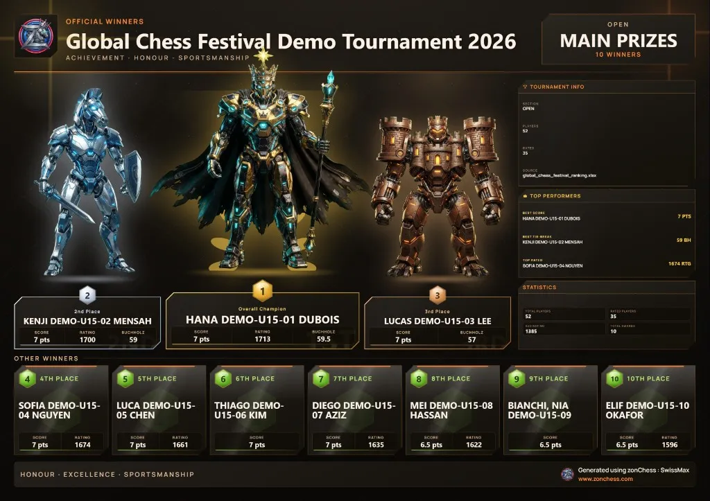
A podium is a shape people already know
Everyone has seen an Olympic rostrum. First is in the centre and tallest. Second is to its left. Third to its right. The eye goes to the middle and works outward — nobody reads a podium left to right the way they read a table.
So a winner graphic has a choice to make. It can present five names as a list, which is accurate but asks the viewer to read carefully. Or it can use the shape people already understand, and be right at a glance. SwissMax uses the shape.
A parent glancing at a photo on WhatsApp does not read left to right. They look at the middle and assume that is the winner. Make sure it is.
So the arrangement is 4–2–1–3–5: fourth on the far left, second next to it, first in the centre, third to the right, fifth on the far right. It reads correctly at a glance, at a distance, on a phone screen, and in a photo taken at an angle by someone standing three metres away — which is how most people will actually see it.
Characters that mean something
Each place carries a chess piece: King for first, then Rook, Bishop, Knight and Pawn. Women's prizes use the Queen where applicable.
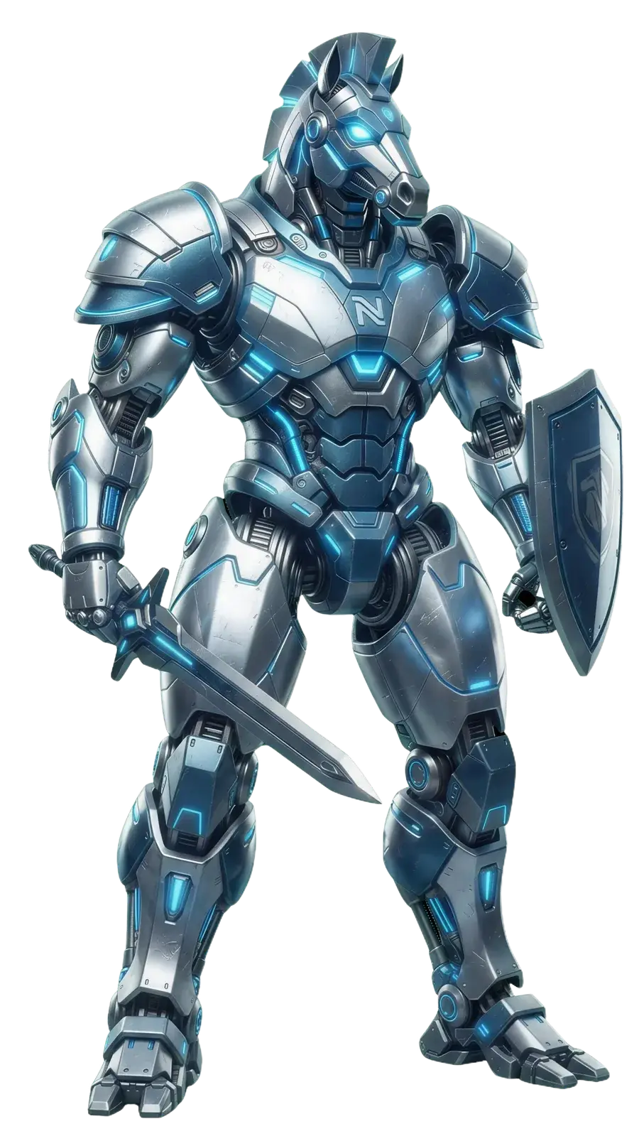
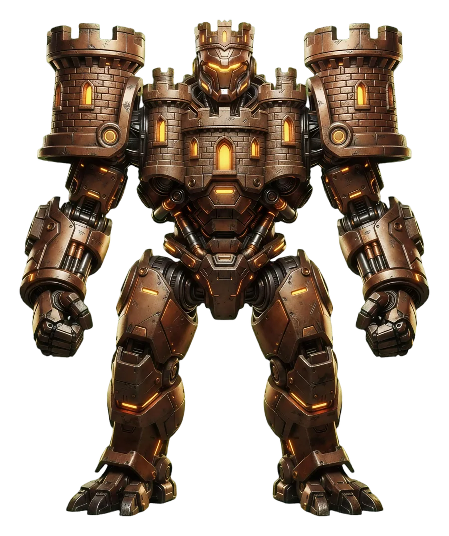
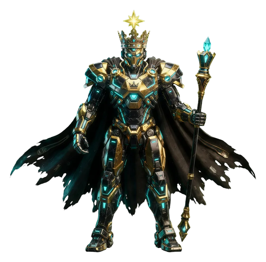
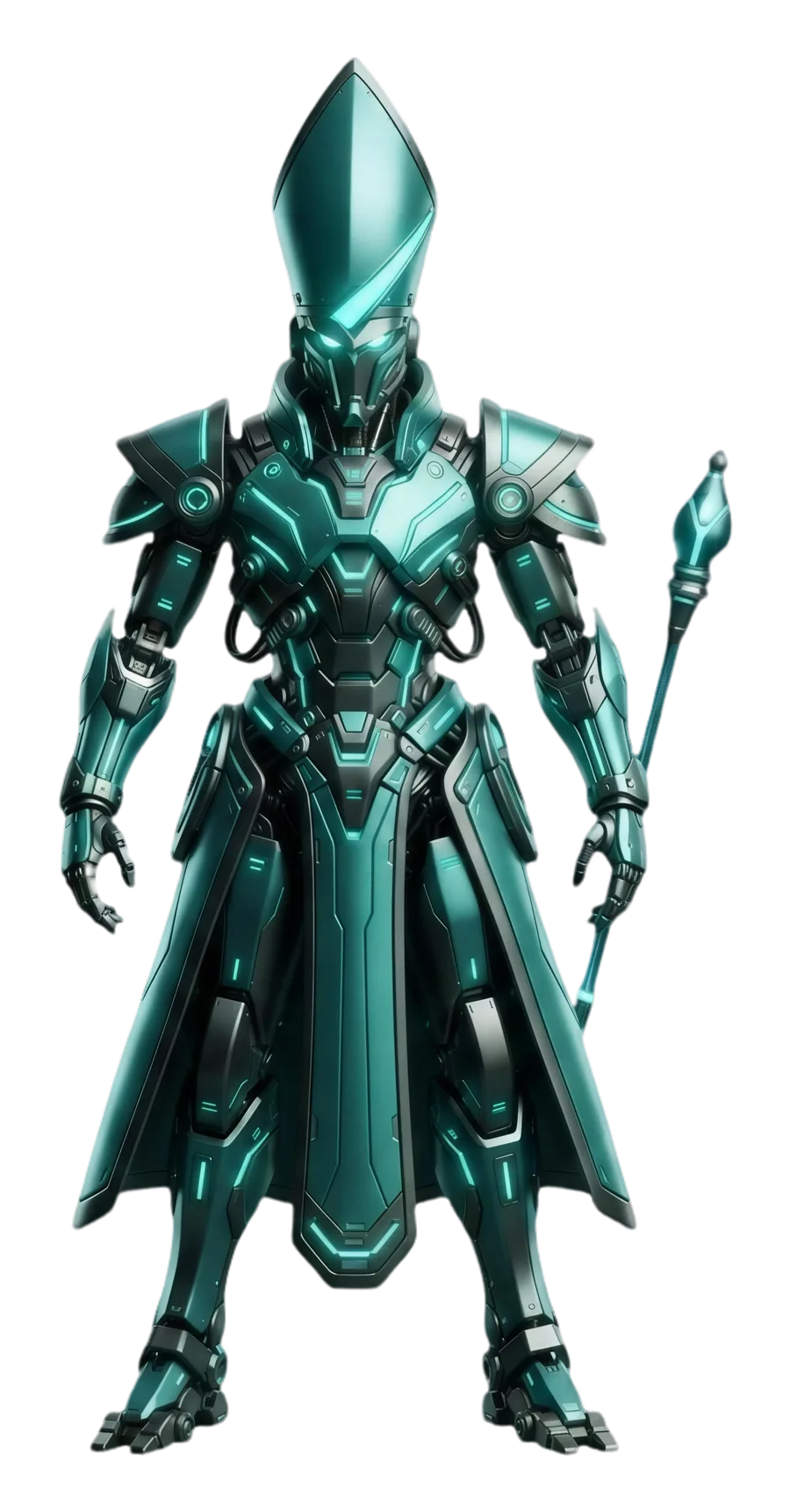
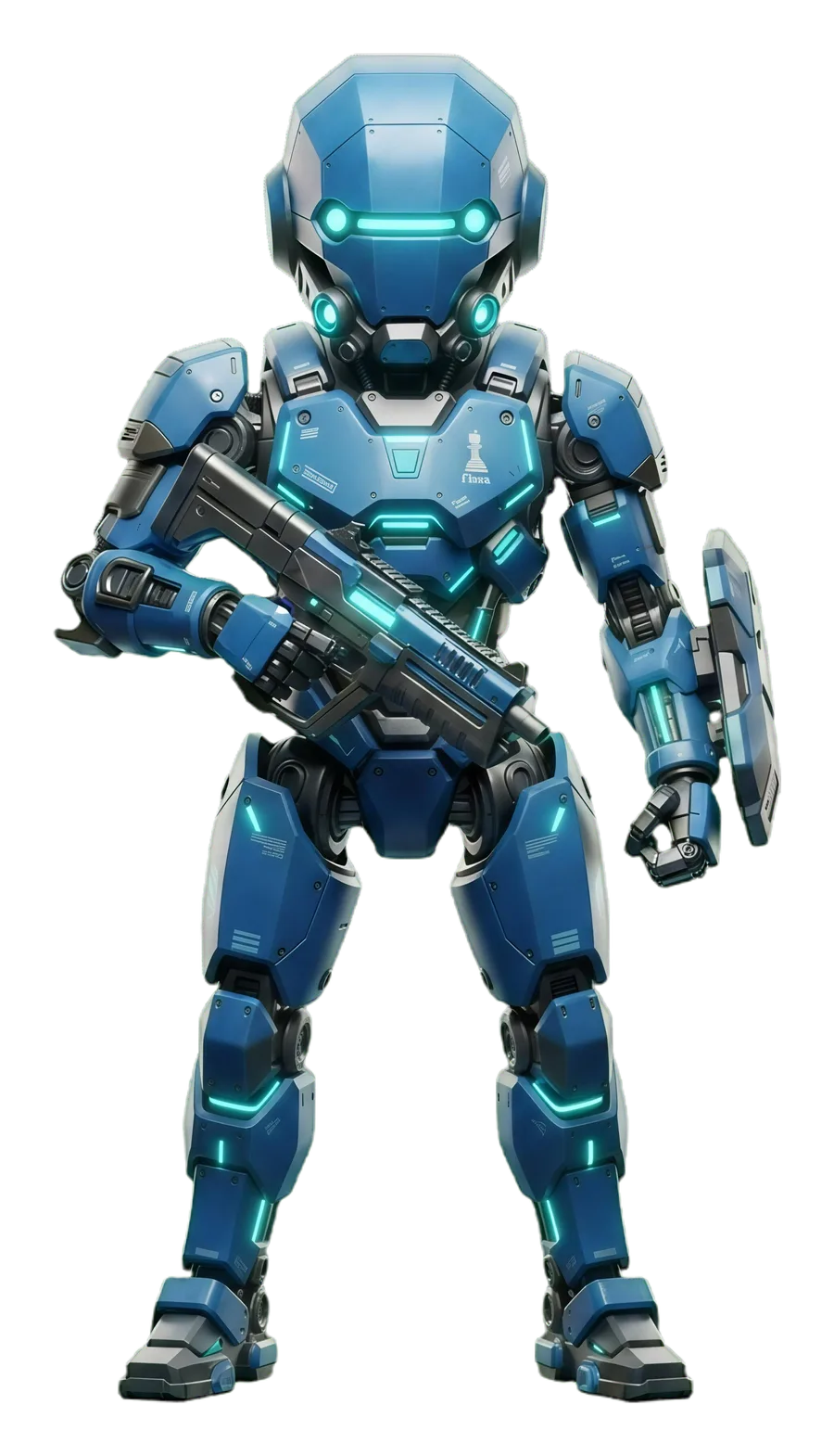
The line-up in screen order — 4, 2, 1, 3, 5 — with the Queen replacing the King on women's prizes where applicable.
This is not arbitrary decoration. Three things it buys:
- Instant place recognition without reading. Younger juniors — and their younger siblings — identify the piece before they parse the numeral.
- Consistency across themes. Whether the event uses the mecha theme, the titanium theme or the clean print variant, first place is always the King. The visual grammar transfers.
- It feels like an occasion. A club event with fifteen participants deserves to look like something happened. That is not vanity; it is the reason a child asks to come back next month.
Designed at print size, not preview size
A winner graphic lives at A4 3508×2480 on a results wall, so that is the size it is designed and checked at — not the comfortable scaled-down preview a screen shows you. Every theme is rendered at full output size before a release goes out, because character placement, spacing and legibility all behave differently once the sheet is real.
Below the podium, sixth place onward continues as a clean list, so a generous prize table stays readable on the same page as the top five.
What the podium refuses to do
Champion Spotlight — the companion graphic for a single winner — shows only the points, tie-breaks and opponent ratings that genuinely exist in the source data. If the final ranking does not carry a tie-break value, the graphic leaves it out rather than showing a zero or a placeholder.
The same rule governs the podium. Everything on it comes from the official final ranking imported into Winner Studio, filtered through the active prize scheme. Official Table, Podium and Champion Spotlight all read that same active scheme, including any one-prize-per-person policy, so there are never three versions of who won.
The arbiter still confirms the truth. SwissMax renders it beautifully; it does not decide it.
Why a layout gets this much attention
Because of everyone it reaches. A pairing sheet is read once and thrown away. A winner graphic is photographed, posted, printed and kept — sometimes for years. It is the single artefact from your event most likely to still exist a decade from now.
That is worth designing carefully, and it is worth checking at full size before anyone prints it. A club event with fifteen participants deserves to look like something happened, because that is precisely what brings a child back next month.